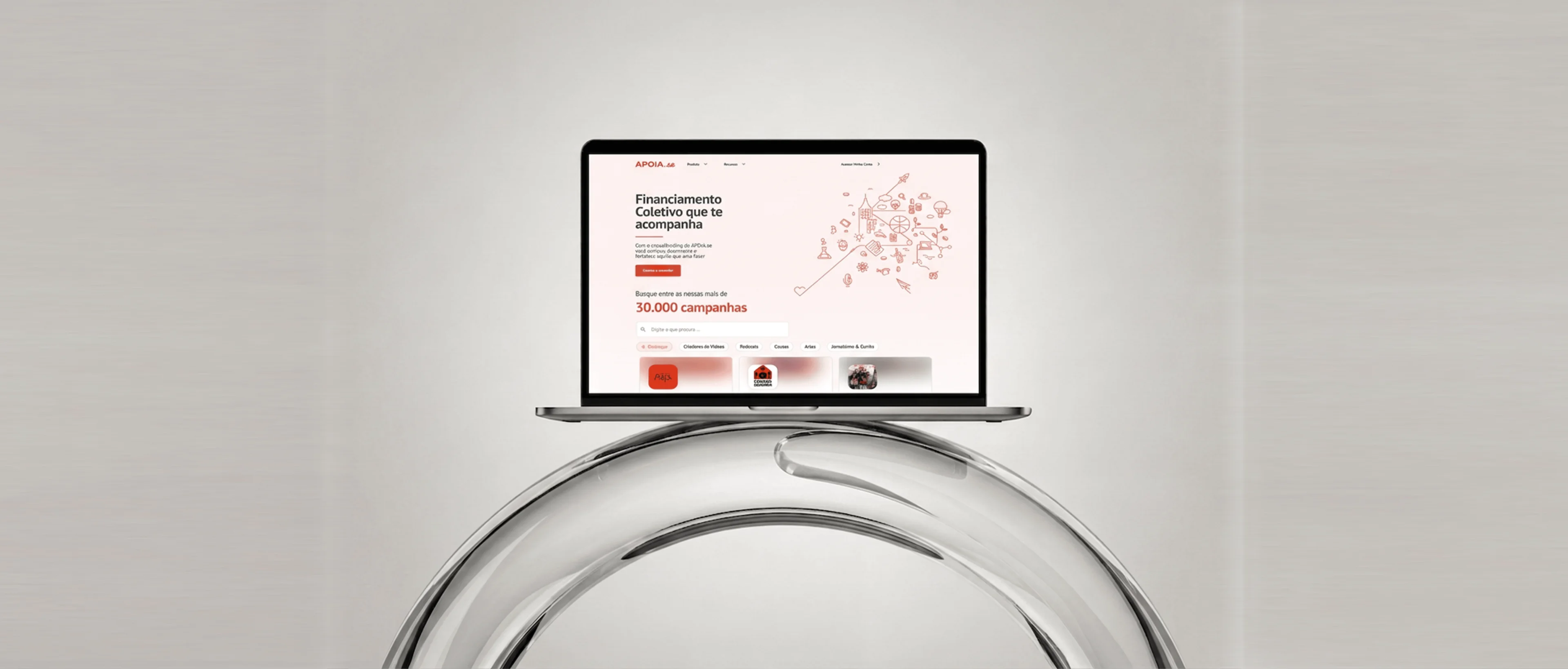
Apoia.se
Fixing an 80% Drop-off in Campaign Creation
Overview
Apoia.se is a crowdfunding platform where campaign creation is the core conversion event, every funded project, every donor relationship, and every dollar raised on the platform depends on a creator successfully completing that flow. Before this project, over 80% of users dropped off after engaging with the platform's primary CTA, most abandoning during the campaign creation process itself rather than at the entry point.
I led both the UX and UI design of the homepage redesign and the full campaign creation flow, working alongside one other Product Designer and one Product Manager over a one year engagement. My scope covered the full design process end to end, from flow architecture and interaction design through to the visual system, componentry, and responsive UI across mobile and desktop.
Business Context
The drop-off was identified at a specific, measurable point: immediately after users engaged with the homepage's primary CTA. From there, abandonment concentrated in the campaign creation flow, where users were expected to complete a dense set of mandatory fields with little guidance about what came next or why it mattered.
This mattered to the business directly, campaign creation is Apoia.se's core activation event. Every user lost mid flow represented not just a failed session, but a campaign that would never launch, never raise funds, and never bring donors onto the platform. Fixing this funnel wasn't a UI polish initiative, it was addressing the platform's primary growth bottleneck.
The two deliverables had different audience scopes: the homepage was designed for both B2B and B2C audiences, since it needed to serve corporate partners exploring the platform alongside individual creators. The campaign creation flow was designed specifically for B2C, focused on the individual creator's end to end journey from idea to live campaign.
Why This Was Hard
The flow was built around bureaucracy, not the user
Campaign creation had accumulated a long list of mandatory fields shaped by internal and legal requirements, with little consideration for how it felt to complete them as a first time creator. The core challenge wasn't removing requirements (most couldn't be removed), it was reshaping a legally necessary, field heavy process into something that felt clean, practical, and low effort.
One flow, multiple user profiles, different needs
Apoia.se supported different types of campaigns, each with different creator intents and different levels of familiarity with crowdfunding. Designing a single flow that stayed simple for a first time creator while still supporting the more complex needs of experienced campaign owners was a recurring tension throughout the project, there was no single “correct” level of guidance that worked for everyone.
Two audiences, one homepage, full responsiveness
Serving B2B and B2C on the same homepage meant designing UI and content hierarchy that spoke to both a corporate evaluator and an individual creator without diluting either message, and doing so consistently across the full range of mobile to desktop breakpoints.
My Role and Ownership
I worked as one of two Product Designers on this project, owning both UX and UI design and partnering closely with a Product Manager across the full one year engagement. My ownership spanned:
Research and diagnosis (competitive benchmarking, user flow auditing with Figma flowcharts and Hotjar session recordings, and behavioral analytics from Google Analytics) to trace the 80% drop-off to its actual source in the funnel, rather than assuming it was a homepage problem.
Stakeholder workshops and user interviews, validating pain points and gathering qualitative feedback directly from existing users and potential campaign creators.
End to end UX and UI design of the homepage redesign (B2B + B2C) and the six step B2C campaign creation flow, including the in flow guidance system, the progress dashboard, and the live campaign preview.
Full responsive design, from mobile to desktop, across both deliverables, not adapted after the fact, but designed as part of the core flow and layout decisions from the start.
Ongoing usability testing throughout the build, not as a single validation gate at the end but as a recurring practice woven into each stage of the flow's construction.
Approach and Key Decisions
Decision 1 (Diagnose before redesigning). Rather than treating the homepage as the problem by default, I ran a three part research phase (competitive benchmarking, user flow audit, and behavioral analytics) that traced the actual drop-off point to the campaign creation flow itself. This reframed the project from “redesign the homepage” to “fix the funnel,” which changed where design effort was allocated.
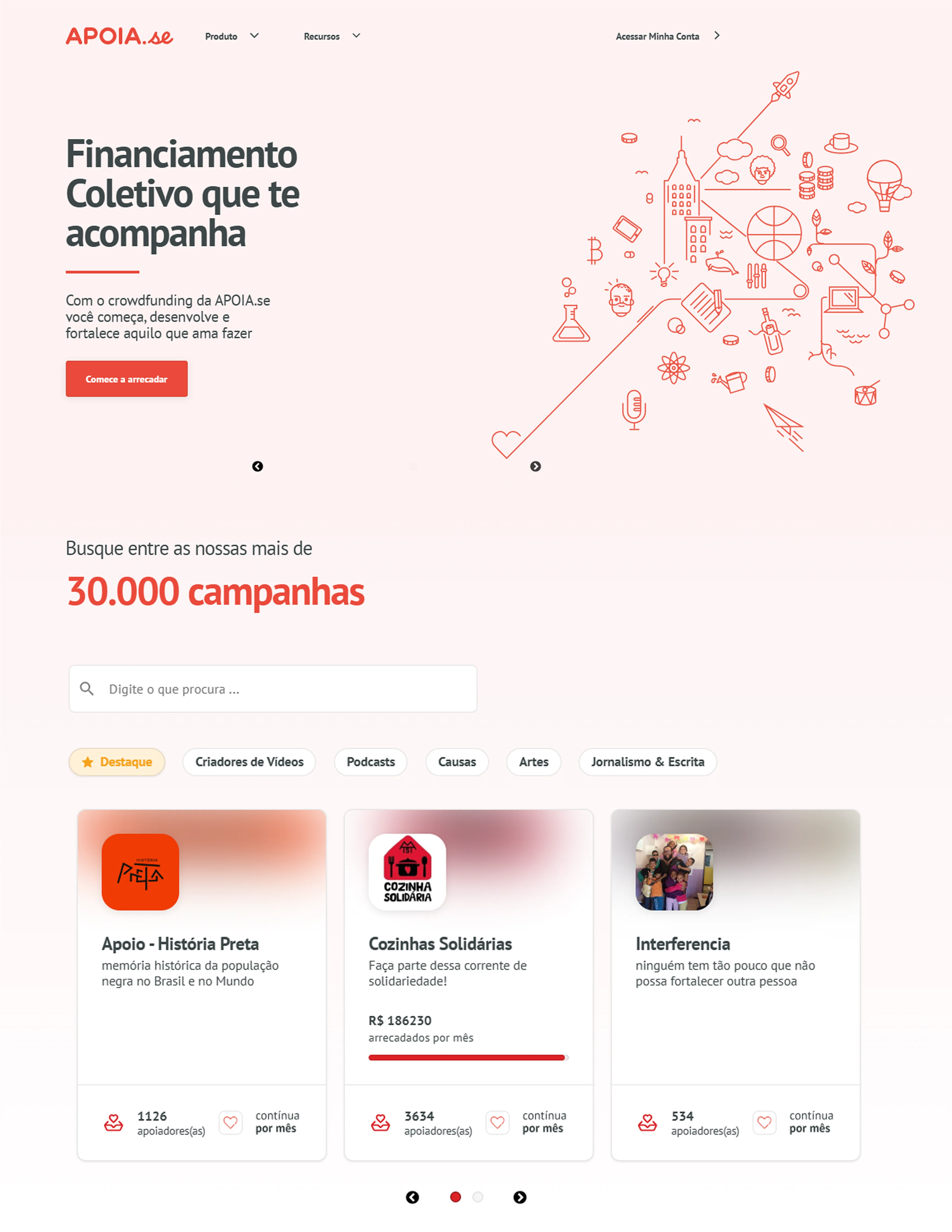
Decision 2 (Make the homepage teach, not just convert, for two distinct audiences). The homepage was redesigned to include explanatory content about the different types of campaigns available on the platform, paired with visual elements that helped users understand and engage with each campaign type before committing. Content and CTA hierarchy were structured to serve both B2B and B2C visitors, with the primary CTA given stronger visual prominence to reduce ambiguity about the platform's next step for either audience.
Decision 3 (Break a dense, bureaucratic form into a structured six step flow). Instead of a single long form, the B2C campaign creation flow was restructured into six discrete steps. This let each step ask for a manageable amount of information at a time, rather than presenting the full weight of mandatory fields upfront, directly addressing the cognitive overload identified in earlier research.
Decision 4 (Guide the user through the entire flow, not just at the start). In flow help and guidance were designed to accompany the user closely through all six steps, rather than front loading instructions in a single onboarding moment that would be forgotten by step three.
Decision 5 (Give users a sense of progress and control). A dashboard was introduced giving users a clear overview of each phase of campaign creation, so they always understood where they were in the process and what remained.
Decision 6 (Let users see their campaign come to life as they build it). A live campaign preview updated in real time as users completed each step, letting them see their campaign taking shape rather than filling out an abstract form disconnected from the end result. This was a deliberate choice to build emotional investment in the flow's completion, the more a creator could see their campaign becoming real, the more reason they had to finish.
Decision 7 (Design UI and interaction as one continuous discipline). As both the UX and UI designer on this project, I carried decisions from flow architecture through to final visual execution myself, component design, visual hierarchy, and interaction states were built in direct response to the UX findings, rather than handed off between separate research and visual phases.
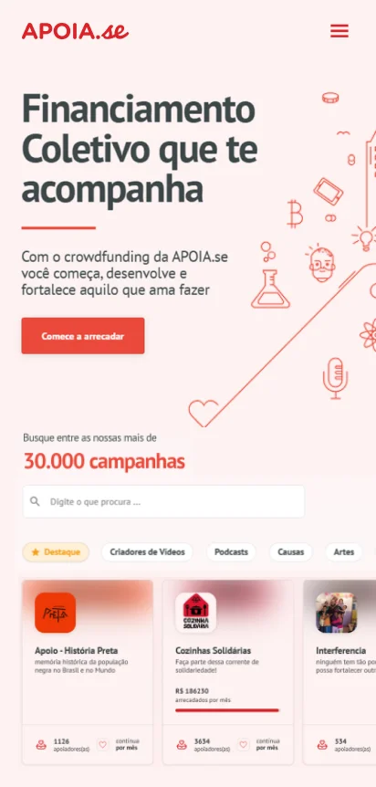
Homepage > Campaign Creation > Campaign Management
The homepage served both B2B and B2C audiences; the six step campaign creation flow and the post publication management views were designed for B2C creators, responsive from mobile to desktop.

Outcomes
Results were tracked qualitatively rather than through a single hard conversion number, and were consistent across every touchpoint of validation:
Immediate positive feedback during usability testing, users responded well to the flow in real time, not only in post launch surveys.
Stronger first impressions during campaign creation, with users reporting the process felt more approachable than the previous version.
A more consolidated sense of trust and adherence to the platform, with users showing greater willingness to complete the flow and return to it (a meaningful signal in a product where campaign creation is a one time, high commitment action per campaign).
Key Learnings
Usability testing belongs throughout the process, not just at the end
Running tests and user interviews continuously (during construction, not only after implementation) surfaced issues while they were still cheap to fix, and shaped decisions I wouldn't have made from research alone.
Design the flow, not the screen
The strongest improvements in this project came from thinking in terms of the full user experience across all six steps, rather than optimizing individual screens in isolation. A well designed screen inside a poorly sequenced flow still fails the user.
Closing Statement
My experience at Apoia.se taught me how important it is to stay attentive to every point in the process, not just the most visible ones. It sharpened my ability to think and design end to end, from UX strategy through UI execution, from the first click on the homepage to the moment a campaign goes live, and shaped how I approach every flow I've designed since.