
Dexco
Simular App & E-commerce Search
Overview
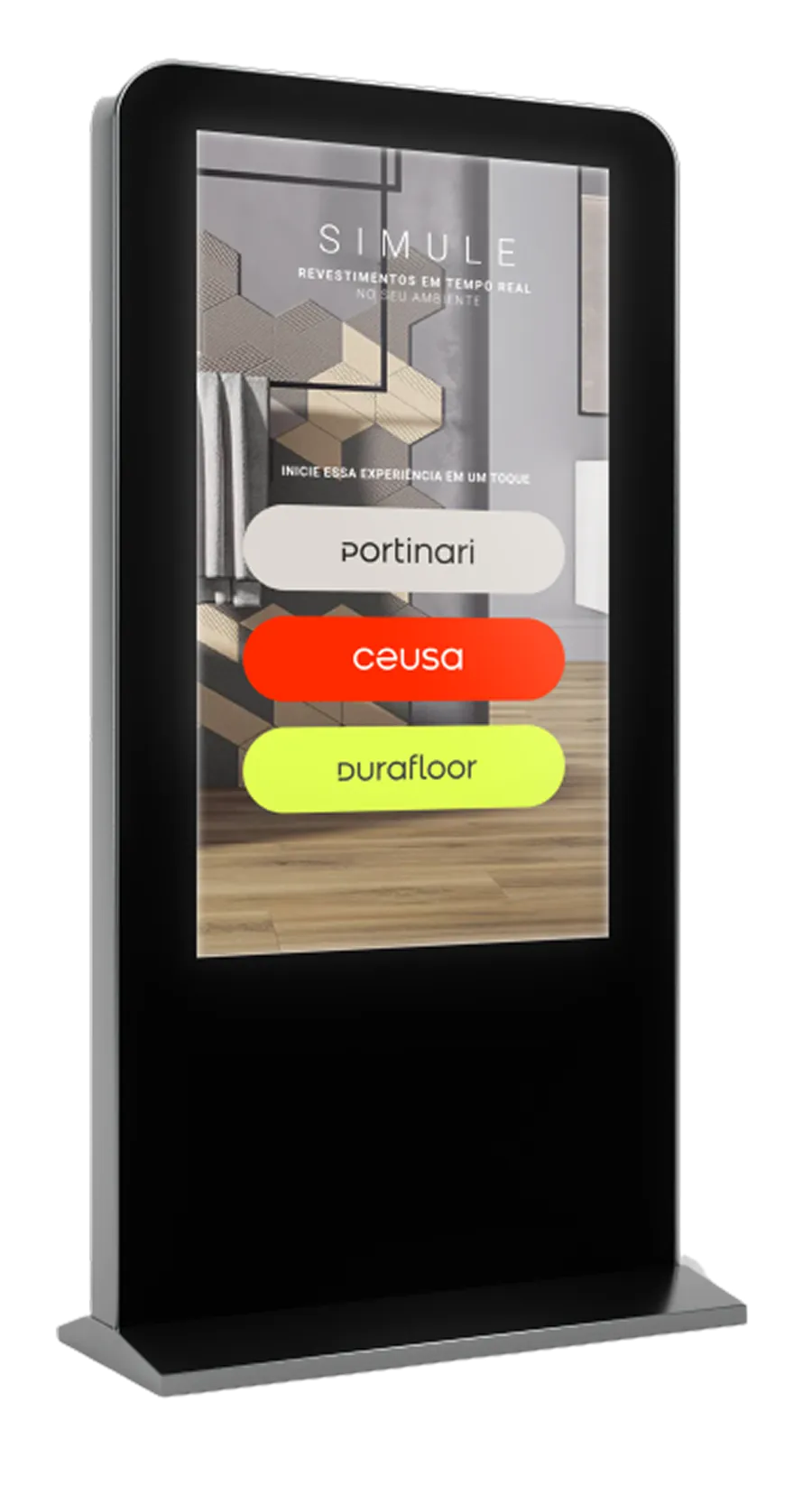
Simular is Dexco's environment simulation platform, letting customers visualize materials applied to real spaces (rooms, bedrooms, offices) before purchasing. It runs on physical totems inside Dexco's VIP stores. Alongside this, I supported the e-commerce team on improving the search and results experience, where users were spending excessive time trying to find and compare products.
I was the lead UX/UI designer on Simular, owning the redesign end to end. On the e-commerce search initiative, I worked as a supporting UX/UI designer within the broader team.
Business Context
Simular's priority came directly from research with VIP store customers, architects and clients consistently said they wanted to see materials applied to their own environment before committing to a purchase, and this simulation step was a fundamental part of converting a visit into a sale. That conversion rate was declining month over month, which made fixing the experience a business priority, not just a UX improvement.
The e-commerce search initiative emerged separately, from observing user behavior on that part of the site. High abandonment and long time on page indicated users were struggling to find what they were looking for, a classic signal of search friction costing conversions. I joined that team specifically to help improve the search experience once this was identified.
Why This Was Hard
Performance was the real bottleneck, not the interface
The core difficulty on Simular was how long it took to load and apply materials to a customer's own uploaded environment. VIP customers expected fast visualization and had little patience to wait, and store staff, sensing that impatience, would sometimes deprioritize the simulation entirely and push straight for the sale instead, undermining the very tool meant to support conversion. Solving this meant investigating backend performance, material loading speed, and application time, alongside shortening the flow itself as much as possible from entry to result.
Search friction was invisible until measured
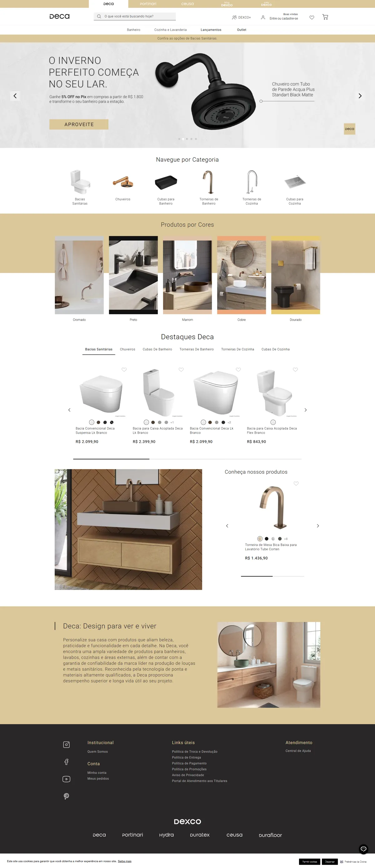
On the e-commerce side, the problem wasn't obvious from looking at the interface alone. Users could see product models, but not stock quantity, color variety, or make quick comparisons, without clicking into each product page individually or typing very specific search terms. This kind of friction only became visible through behavioral tracking, not surface level review.
My Role and Ownership
I was the lead UX/UI designer on Simular, working alongside a team of 2 designers and 1 lead designer, and owned that project end to end. On the e-commerce search flow, I worked as a supporting UX/UI designer within the existing team. Across both:
Led persona ecosystem mapping as the starting point for the Simular redesign, understanding the full set of people and touchpoints involved, from customer to architect to in-store staff.
Investigated performance bottlenecks in material loading and application time, working closely with backend to identify what could be optimized, uncovering and resolving a bug that was preventing the correct store's stock from being pulled reliably.
Redesigned the Simular flow end to end, from photo upload through material application to sharing, shortening every step that didn't need to exist.
Supported the e-commerce team in redesigning the search dropdown, results page, and product comparison experience, contributing UX and UI decisions within a collaborative process.
Approach and Key Decisions
Decision 1 (Start with who is actually in the room). I led a persona ecosystem mapping exercise for Simular, since the tool wasn't just serving the customer directly, it also involved architects reviewing shared results and store staff guiding the interaction. Understanding all three shaped decisions that a customer only view would have missed.
Decision 2 (Treat speed as a design problem, not just an engineering one). Since VIP customers expected fast results and staff would abandon the tool under pressure, I treated loading and application speed as core to the design, not a backend concern to hand off separately. Investigating performance alongside backend surfaced a bug that was preventing the correct store's stock from being pulled, fixing it alongside the broader speed improvements resolved a limitation that had been quietly undermining the tool's reliability.
Decision 3 (Shorten the flow to its essential steps). I reduced the Simular flow from entry, through photo upload, material application, and sharing, to the minimum necessary sequence. Combined with the backend performance and stock-pull fix, this cut the average flow time from 6 minutes to 3 minutes, based on research and testing across a range of customer profiles.
Decision 4 (Surface product information before the click, not after). For e-commerce search, rather than requiring users to open each product page to see color, stock, and collection details, I supported adding this information directly into the product preview card, along with the ability to compare as many products as the user wanted at once.
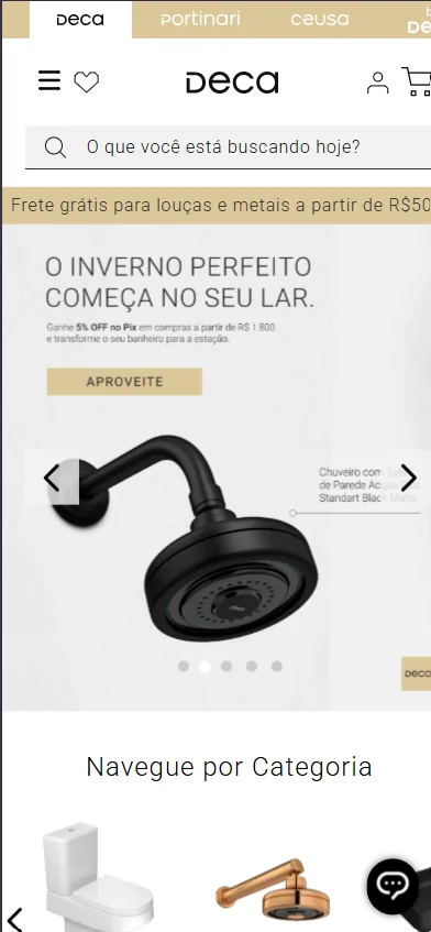
Decision 5 (Predict intent instead of waiting for a perfect query). A dropdown was added showing product suggestions as the user typed, reducing how long they waited for results, and the results page itself was updated to prioritize products matching the exact or closest sequence of searched words, rather than a broader, less relevant match.
Decision 6 (Measure what actually changed for the user). Both projects were validated with real timing data rather than assumptions, the Simular flow average dropped from 6 to 3 minutes, and average time spent in the e-commerce search bar dropped from 1 minute to 20 seconds, giving concrete evidence that the friction identified in research had actually been reduced.
Simular > Material Application
E-commerce Search Updates
Simular runs on physical totems inside Dexco's VIP stores, from photo upload through material application to sharing; the e-commerce search work covered the search dropdown, the results page ranking, and product comparison from the preview card.


Outcomes
Simular's flow time was cut in half, from an average of 6 minutes to 3 minutes, directly addressing the impatience that was leading VIP customers and store staff to deprioritize the tool.
The store stock-pull bug was resolved as part of the backend performance work, ensuring Simular reliably reflected the correct store's active inventory.
Average time in e-commerce search dropped from 1 minute to 20 seconds, showing the dropdown suggestions and improved results ranking meaningfully reduced search friction.
Product comparison became possible directly from the preview card, removing the need to open multiple product pages just to compare colors, stock, and collections.
Key Learnings
The expected improvement is rarely the only improvement that matters
Every product has its own type of user, and every group of users has its own preferences, the possibilities are close to endless. This is why keeping research and validation active throughout the process, not just at the start, is essential, assumptions that hold for one user group can miss entirely for another. On Simular, this played out literally, chasing simulation speed also surfaced and fixed a stock accuracy bug that hadn't been the original target.
Closing Statement
Simular taught me that the best interface in the world doesn't matter if the moment behind it feels slow, speed and flow length are UX decisions just as much as layout and hierarchy are. Supporting the e-commerce search project alongside it reinforced the same lesson from a different angle, sometimes the friction users feel isn't visible until you go looking for it in their behavior, not their feedback. Both projects sharpened how closely I now watch the full experience around a feature, not just the feature itself.